
White Pearl Care
White Pearl Care is a new service established in 2021. It’s a modern facility that has been developed from the heart of the providers. It has been extensively redesigned to ensure a comfortable, personal, spacious and safe environment to meet the needs of the individuals in our care. The ethos of our service is to ensure all individuals are provided with specialist care and treatment to meet their individualised needs.
Our brief was to create a brand identity that distinguishes this place from others, whilst highlighting it’s up-to-date and modern approach to autism and healing.
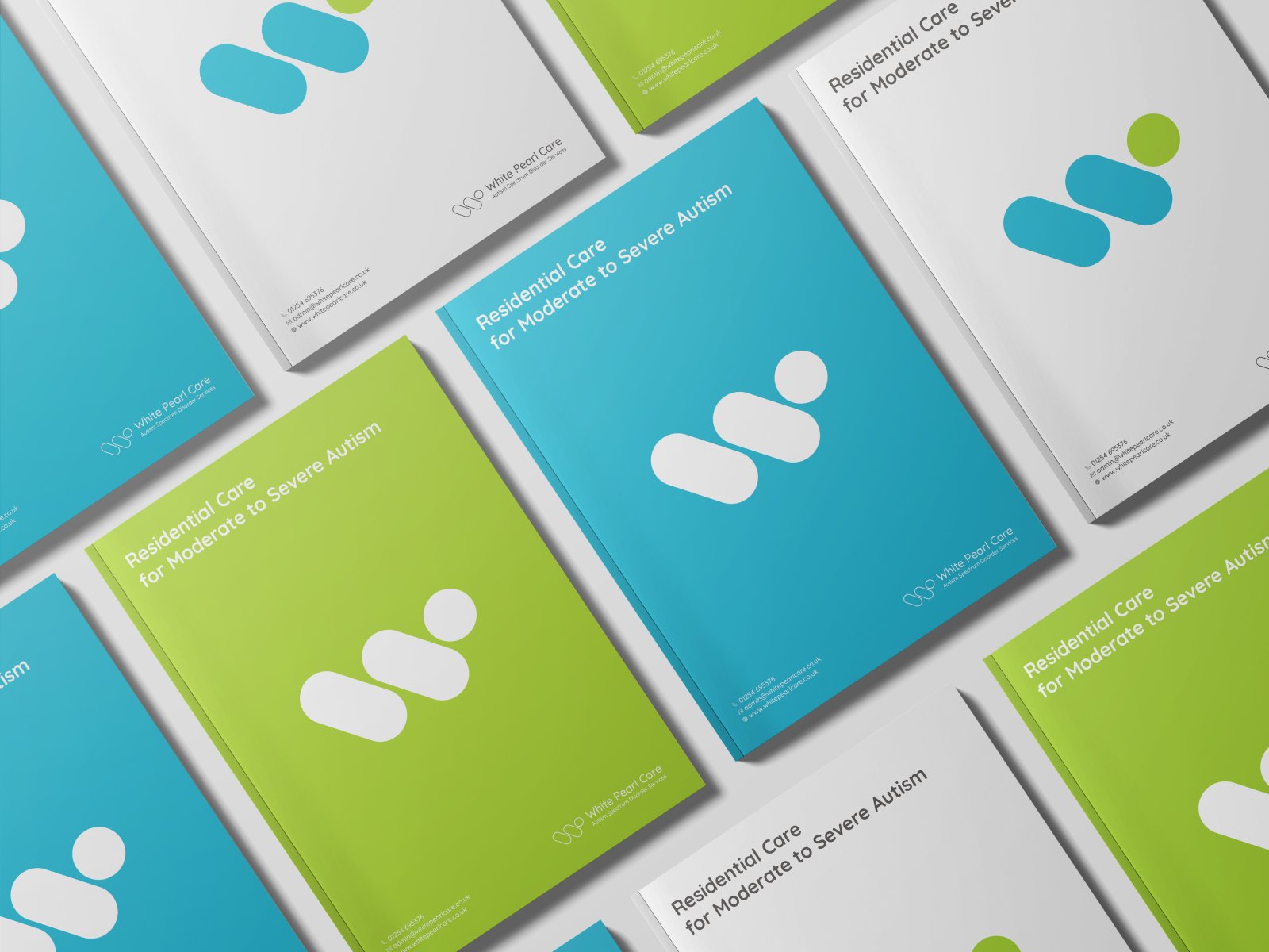
WPC logo consists of three factors. Two of them are inspired by the facility name: a “W” letter and a circular pearl shape. The third one is a form inspired by one of the most important elements in White Pearl Care treatment plan - physical health. The shape reflects the dynamic movement of a person and binds all of the elements together: the “W” letter, pearl shape and physical health (movement / engagement / embracement).

We also developed a sensory colour palette to capture in a beautifully authentic way the life in White Pearl Care home: calm, healing whilst lively and full of happiness.