Footprint Design Branding
Good logo design doesn’t look the same for every brand. What we mean by that, is that your brand identity is the most important factor to consider when you’re designing your logo—in fact, it’s the most important factor.
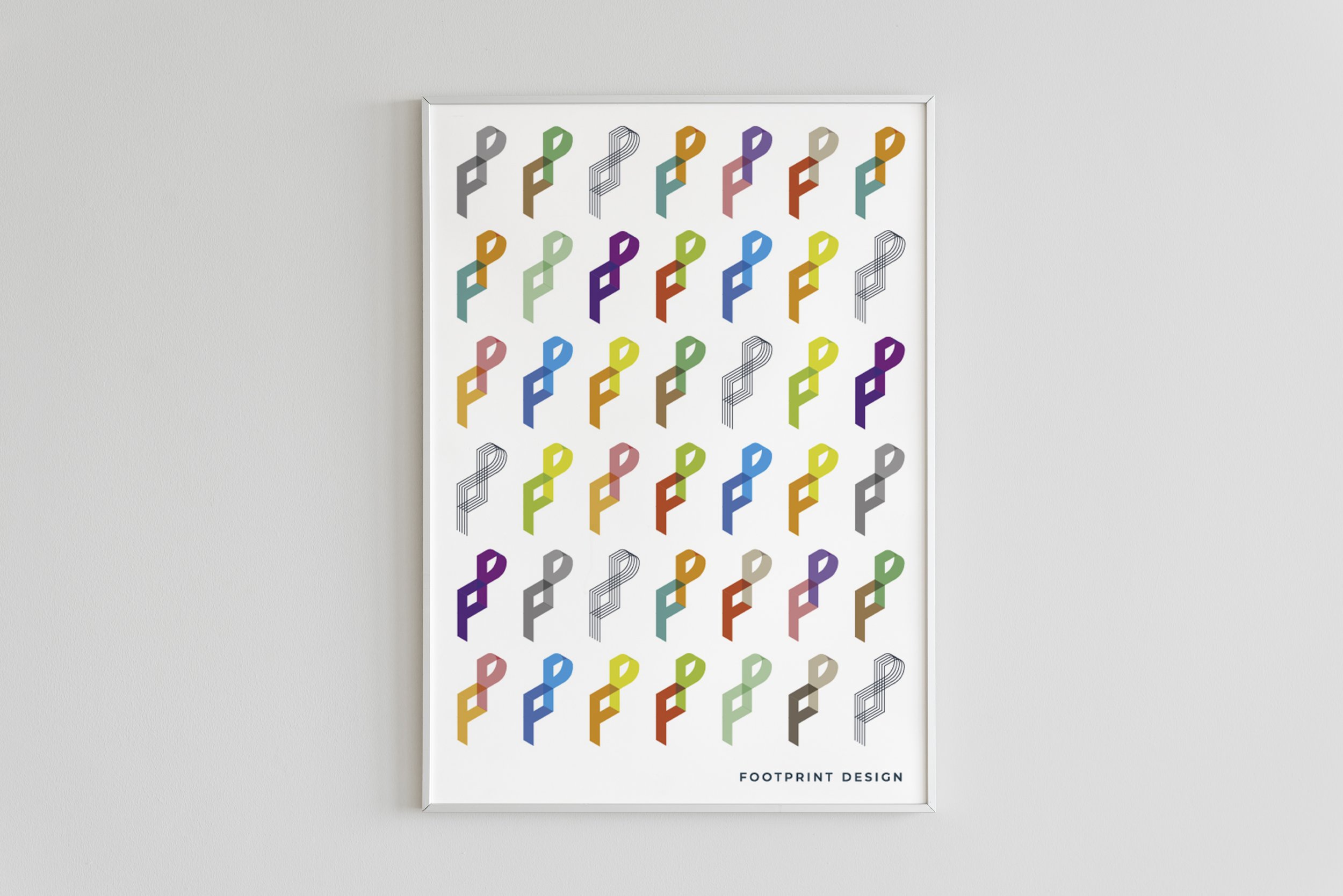
For our logo we took inspiration from geometry and construction design. First we deconstructed the letter F and P into wireframe forms, connected them together and then projected them in isometric view.

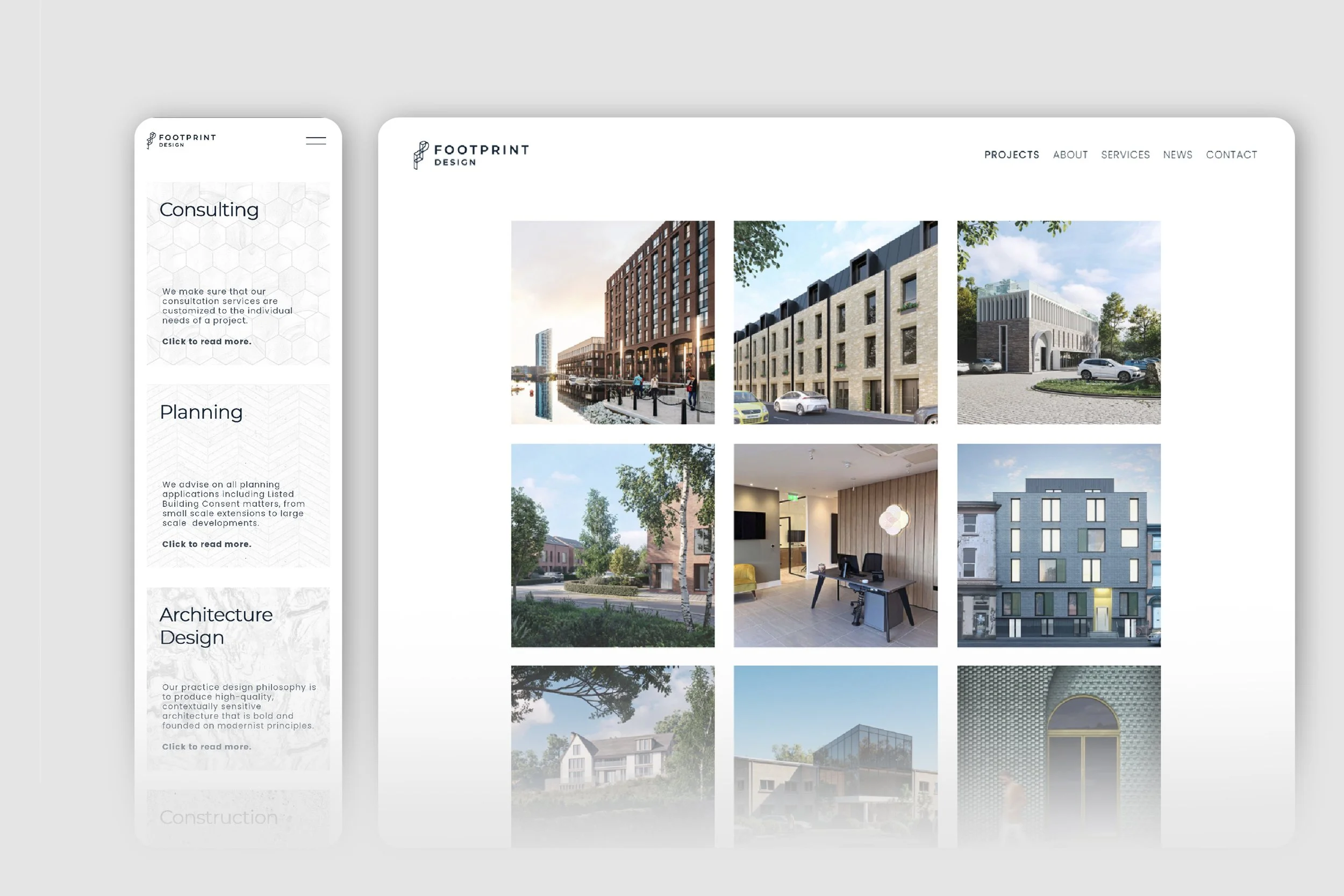
We are a young company that specialises i.a. in architecture and graphic design. We work on various types of projects, so it was important to us to create a logo that can reflect both sides of our business: serious & official + fun & relaxed.
The resulting form can be easily shown in two ways. Single FP monogram is classy, calm and serious and works well for more official situations. Disconnected wireframe form, mirrored, rotated and multiplied make a modern, fun and funky logo.