
Bevington Bush Development - Branding
Bevington Bush is one of the most prominent property developments in Liverpool. The brief was to create a visual identity that will appeal to young professionals and expats, a constantly growing group in the city.
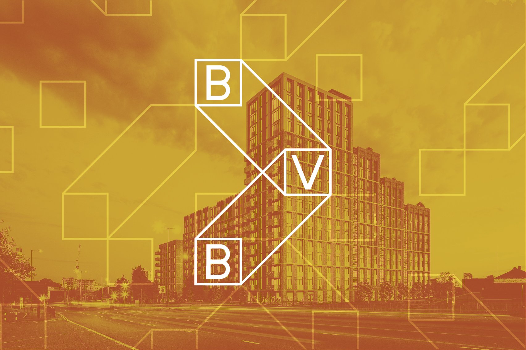
We designed a bold identity with a technical visual language, conveying a clear message of innovation and forward-thinking.

Bevington Bush in Liverpool used to be a tiny hamlet consisting of no more than an inn and handful of cottages. In the late 18th Century the place was a destination for sailors, taking them away from the dirtiness of the town. Bevington Bush gave the origin to the Scouse term ‘going for a bevvy’ - to have a drink or a pint of beer.
Bevington Bush is a place that matters in a local community, so one of the most important parts of our design was to highlight it’s significance and make it, once again, a destination itself.
The idea was to support the name with a strong visual icon, which will stay in people's minds. The solution resolved as a highly memorable, bold logo using a mix of bright yellow, black and white. The form is clean, minimalist and geometric. It underlines the main letters: B, V and B.


